


Canvas, Components, and Layout
Open the Cold Chain Warehouse designer from the 2D SCADA list. Use this case to inspect the canvas, component settings, and layers without binding devices or modifying the original project.
1. Before You Start
| Item | Details |
|---|---|
| Entry point | Visualization → SCADA Management → 2D SCADA → Edit |
| Permissions | Access the project designer. Make changes only in a project you own. |
| What to check | Whether the target is desktop or mobile, and the aspect ratio of the display |
2. Set Up the Canvas and Components
- Click a blank part of the canvas. Check Background Name, Resolution, Background Color, Background Image, and Drag and Zoom in the right panel. Set a resolution for the target screen. Toolbar zoom changes only the editor view, not the canvas dimensions.
- Find components under Basic, Statistics, Images, Charts, Models, or More. In a new view, place the background and containers before text, numeric displays, and interactive controls.
- Select the Average Warehouse Temperature text. The right panel shows Layout, Data, and Layers. Use Layout → Position and Size to check X, Y, width, and height, and Basic Style to check typography and style.
- Align and group related metrics. Use Bring to Front and Send to Back to manage overlaps, then lock backgrounds that should not move. In Layers, check whether a component is covered or hidden.
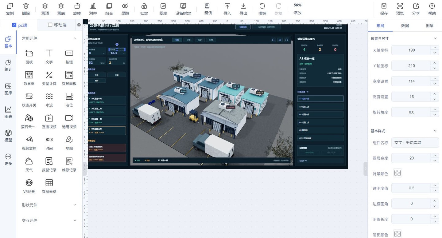
Follow the screenshot: Check that PC is selected on the left, then match the selected Average Warehouse Temperature text on the canvas to the component name on the right. Click an empty area of the canvas before changing the page dimensions. The toolbar's 50% setting changes only the editor view, not the project resolution. While editing, use the tab below the canvas to confirm the current page.
3. Editor Sections and Toolbar
The SCADA editor consists mainly of the top toolbar, the component library on the left, the canvas, and the configuration panel on the right.
| Area | Purpose |
|---|---|
| Top toolbar | Copy, delete, bring to front, send to back, rotate, align, group, show or hide, and lock components; also provides device binding, cases, import and export, undo and redo, saving, and preview |
| Desktop and mobile | Organize views separately for different devices. Decide the delivery dimensions first, rather than waiting until the desktop view is complete to consider mobile. |
| Component library | Choose components from Basic, Statistics, Images, Charts, Models, and More, then drag them onto the canvas and configure them. |
| Canvas | Place and group backgrounds, components, and business sections to build a process flow or device monitoring view. |
| Right configuration panel | Configure the page when no component is selected. Select a component to modify it through Layout, Data, and Layers. |
Group organizes related components as a group. Lock prevents completed backgrounds or containers from being moved accidentally. Bring to Front and Send to Back adjust overlaps. Undo and redo are editing operations, not a substitute for confirming that changes have been saved.
4. Page and Component Configuration
Click a blank area of the canvas to configure the page, or select a component to configure that component. The available settings differ between components.
| Setting | Details |
|---|---|
| Background Name | Identifies the business purpose of the current canvas |
| Resolution | Sets the canvas width and height. Choose it for the target screen's aspect ratio; editor zoom is not a substitute for setting dimensions. |
| Background Color and Background Image | Set the page's base color and background image. The background should not cover business components. |
| Drag and Zoom | Determines whether users can drag and zoom the canvas in the runtime preview |
| Position and Size | Sets the component's X and Y coordinates, width, height, and rotation angle |
| Basic Style | Sets the name, text, color, opacity, border, font, and other styles, depending on the selected component |
| Layers | Locate components, check their order, visibility, and lock state, and troubleshoot components that cannot be selected or are covered. |
Use component names that describe their business purpose, such as 主泵运行状态, 进水口压力, or 温度趋势图, rather than only 组件1 or 文本2, to make later searches and maintenance easier.
5. Choose Components for the Task
| Type | Purpose and common components | Configuration focus |
|---|---|---|
| Basics and shapes | Panels, text, rectangles, circles, and lines for page structure and process connections | Layout, layer order, and style |
| Data display | Numeric display boxes, numeric display panels, and data tables for single values or multiple data points | Variable source, units, precision, and offline state |
| Status and control | Status switches, buttons, and similar components for operating states and controls | Distinguish read-only displays from writable controls, and verify command values and returned reports. |
| Statistics and charts | Line charts, bar charts, and similar components for trends and category comparisons | Request results, field mapping, and refresh frequency |
| Image library | Industrial equipment, pipes, indicator lights, backgrounds, and other assets | Asset references, scaling, and status styles |
| Video and business | Video, alarm records, maintenance records, and similar components | Data or channel sources and access permissions; avoid loading too many resource-intensive components at once. |
| Models | Embed a model display in the 2D canvas | Model resources, interaction, and camera settings; this is not the standalone 3D scene editor. |
| Custom components | Business components maintained and reused through the Resource Center | Component parameters, data interfaces, and version compatibility |
Prefer a numeric display for a single live value, a trend chart for a metric that changes over time, and a table for comparing multiple data points. Include only the data that the current business task actually needs to compare, rather than putting every Thing Model field on one view.
6. Check the Result
- In the preview, check that the view edges, labels, and units are not clipped.
- For mobile delivery, check the mobile configuration in the editor and preview at the target dimensions. Do not rely only on the editor thumbnail.
- Text, numeric values, and actionable controls should be distinguishable. Correct placement does not mean data is connected. See Device Binding, Properties, and Data.